

He2
He2
Herbal Essences: Evolve a Design Icon
My responsibility included:
- Lead ID contact for the brand team
- Visual language strategy
- P&G version bottle assessment
- Concept Exploration
- CAD development, refinement
- Animation creation
Herbal Essences exists to make beauty a pleasure through nature. In 2015 the brand intends to win with among all Naturally Expressive Indulgers (34% of global female population) and become the leading global share brand in the mid tier segment.
The objective of this project is to redesign the Herbal Essences structural packaging to convey the brand strategy and evolving equity assets for the year 2015.
Dive into the Herbal World
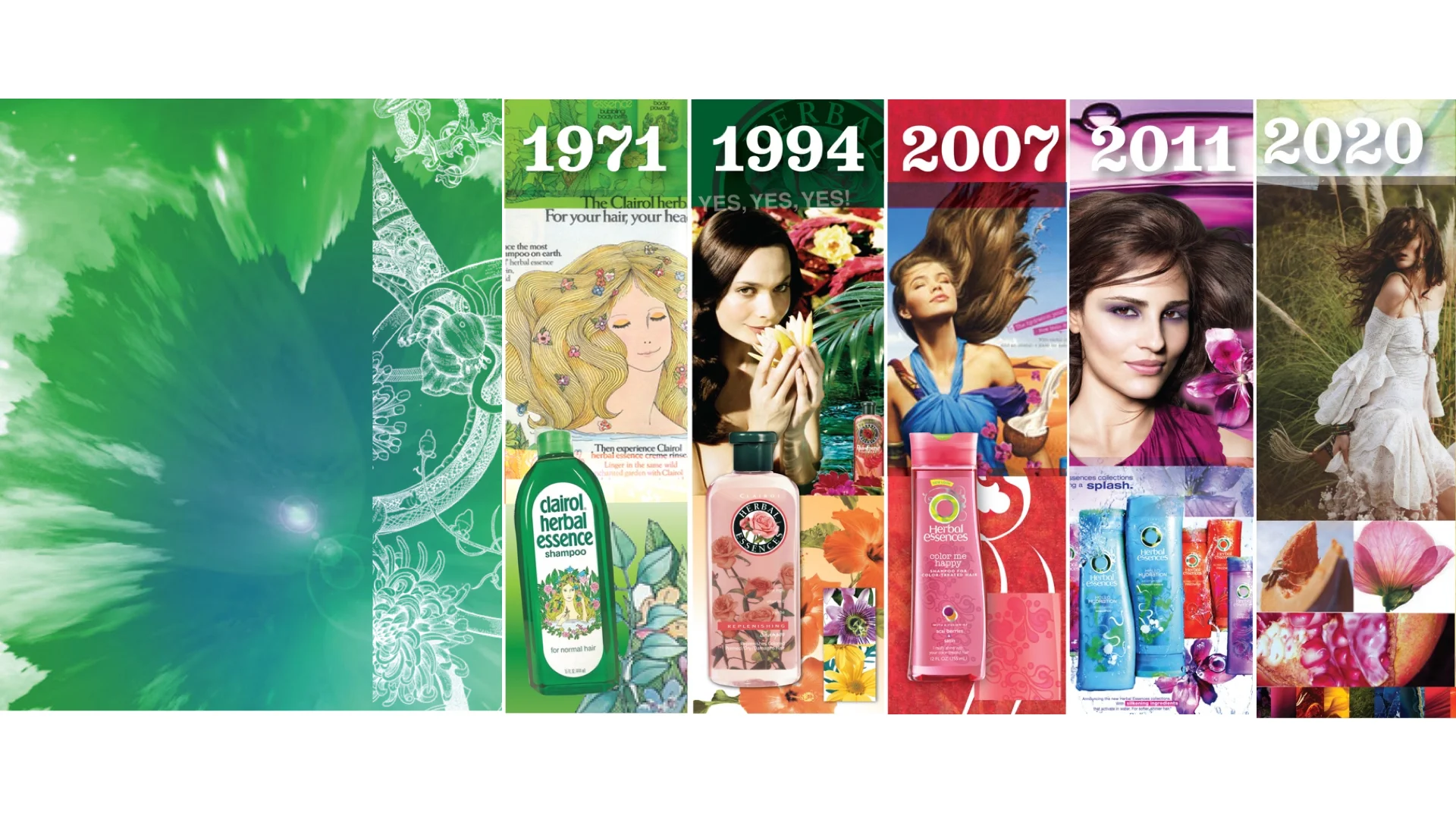
Herbal Essences was born an original natural hair care brand. Its natural ingredients with surprising transformational stories make beauty a pleasurable experience.
Brand Character: sensuous, spirited, sparkling wit

He3
He3
The Creative Challenge
The creative challenge here is to design something in between that connects P&G’s Future Vision with what the brand has historically owned in form/ materials/ colors/ finishes. The current shampoo and conditioner bottles features a "flip" application of structure and graphic which encourages retailer to sell both shampoo and conditioner side-by-side.
P&G future vision bottle Assessment - To understand client's strategy and future vision

He6
He6
Design Inspiration
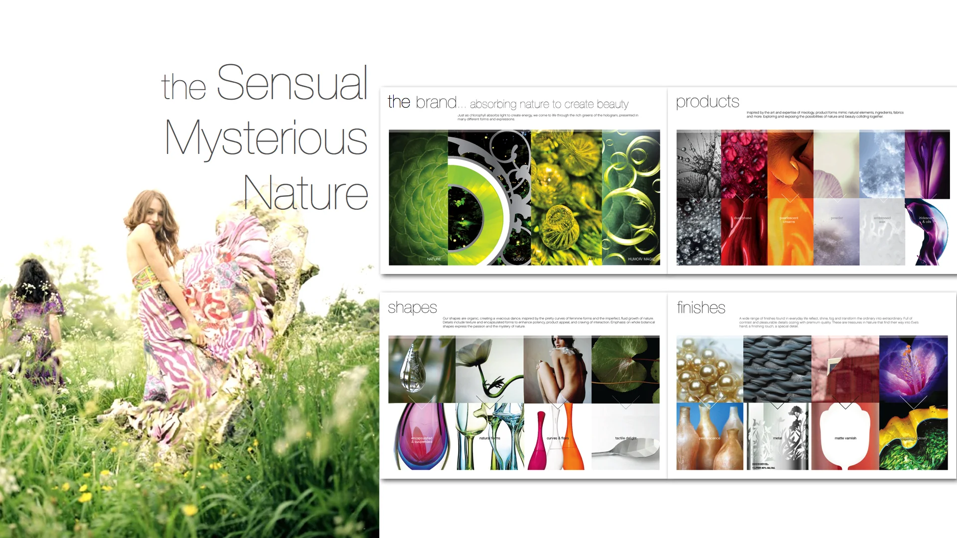
The target consumer are “Naturally expressive indulger”. They like discovering the raw, captivating, mysterious & powerful quality of mother nature and celebrate authentic beauty with the world. Nature forms are my source of inspiration. They are beautifully and sensually blend beyond the simple three dimensions- there is no "front" "side" and "top" when describing the form.

He5
He5
Form Exploration
The initial exploration was concentrated on creating the "Nesting" forms - the equity the brand owns as to have the shampoo right side up and the conditioner bottle upside down. To bring this "dancing together" notion into a newer level, exploration was done in a way to look at relations of surfaces beyond front profile, creating two objects that are "craving" for interaction.

He7
He7

He8
He8
3D Refinement
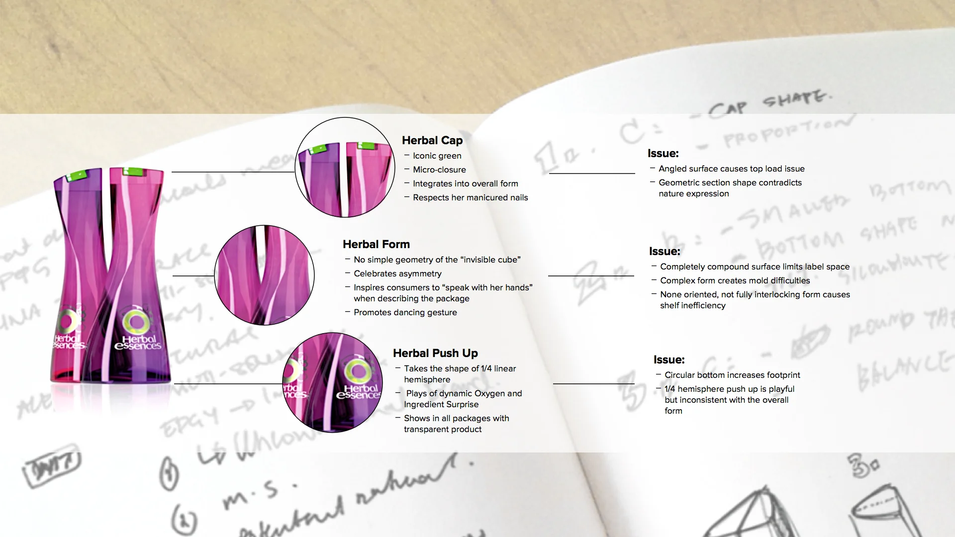
The refined design wove the nature story through organic form and shapes, exposing the possibilities of nature and beauty colliding together.
Familiar cues connects people with what the brand has owned, while the enhanced nesting gesture evolves the “dance together” theme in a fluid, expressive, 3 dimensional way, which drives regiment between shampoo and conditioner.

He9
He9

He10
He10
Prototyping
Created prototype to test the ergonomic aspect of the design.

He11
He11
Further Dimension
I worked with graphic team to develop the color and graphic strategy. One concept stood out in this phase as it adds another level of interaction to the structure. Driven by simple glass marble with it’s magnetic suspension and the 360 degree perspective, this concept goes beyond a front and back package, encouraging people to pick this up and turn it around to see the suspended image.

He12
He12
360 Animation
Created 360 degree animation to enhance client's experience of viewing the 3D structure and the marble effect of the label concept in space.

